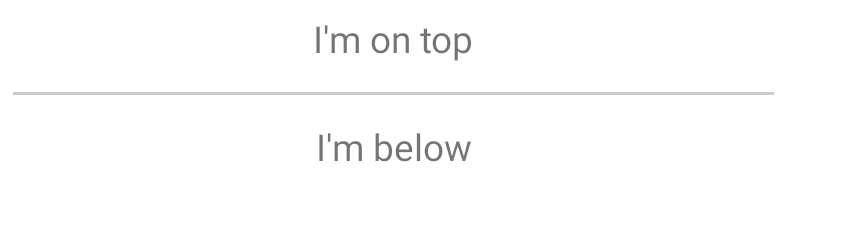
Divider
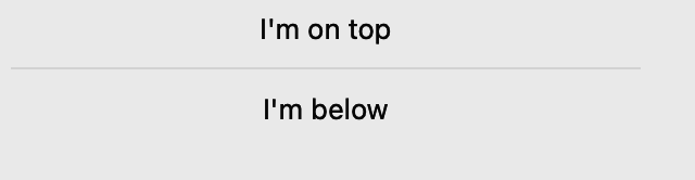
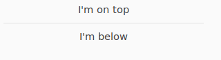
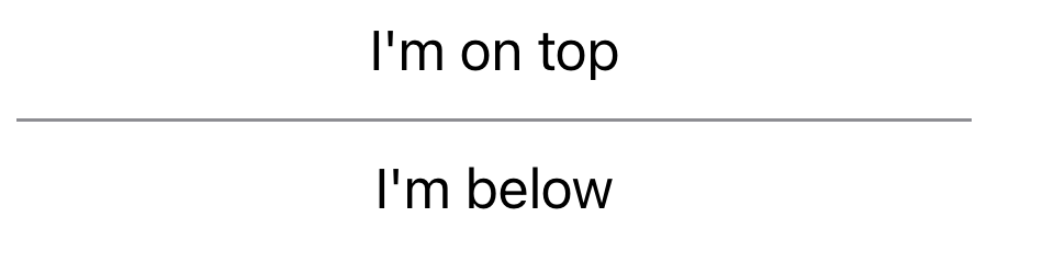
A separator used to visually distinguish two sections of content in a layout.
Not supported
Screenshot not available
Not supported
Usage
To separate two labels stacked vertically with a horizontal line:
import toga
from toga.style.pack import Pack, COLUMN

box = toga.Box(
    children=[
        toga.Label("First section"),
        toga.Divider(),
        toga.Label("Second section"),
    ],
    direction=COLUMN,
    flex=1,
    margin=10
)
The direction (horizontal or vertical) can be given as an argument. If not specified, it will default to horizontal.
Reference
Divider(
    id: str | None = None,
    style: StyleT | None = None,
    direction: Direction = HORIZONTAL,
    **kwargs,
)
Bases: Widget
Create a new divider line.
| PARAMETER | DESCRIPTION |
|---|---|
id
|
The ID for the widget.
TYPE:
|
style
|
A style object. If no style is provided, a default style will be applied to the widget.
TYPE:
|
direction
|
The direction in which the divider will be drawn. Either
TYPE:
|
kwargs
|
Initial style properties.
DEFAULT:
|
property
writable
direction: Direction
The direction in which the visual separator will be drawn.